It may not immediately dawn upon you, but the fact is that colors can make one place extremely beautiful and another too disappointing. Studies also show that product and architectural shades determine nearly 60% of people’s response to an object or area. Its contribution in attracting anyone’s attention is enormous. That’s why you come across the terminology color psychology, perhaps. However, it doesn’t mean color bears a definitive relationship with moods, although it can create a positive impact to a certain degree. If not for anything else, you must be careful about what you pick for your home for its role in the overall ambiance and psychological response. Here are some suggestions to lead you to your selection of paints, right colors for home interiors. Let’s hear about them.
Choose a small area
You may not know how a particular paint would look in its entirety at once. So starting with a small place, like a bathroom or powder room, can be best. Or, you can play even safer by using it as an accent. If you want to try this yourself initially, you can choose the most accessible corner of your house to get quicker results. Whether it makes you happy or disappointed in the end, you should not stop your journey.
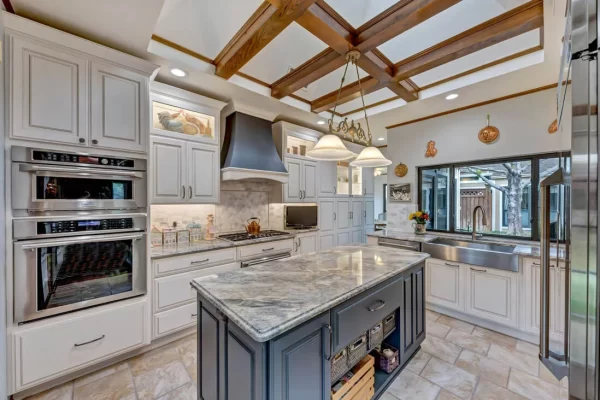
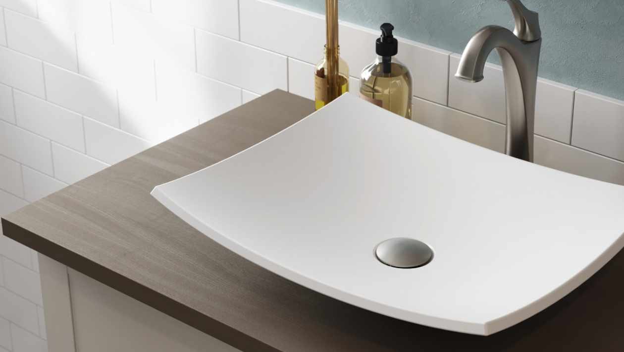
You can look at the artwork, dishes, accessories, furniture, rugs, appliances, and other items for some inspiration about the color choice. For example, if you use a popular Kraus sink in black, you can feel tempted to incorporate it extensively.
Earlier, you may have invited disdainful or mocking frowns even for casually expressing your desire to go for black walls in a home. Today, it is a trendy thing, well-known for building a dramatic tone. Still, you have to be conscious about this decision because removing dark colors is not so simple. You will need to add layers of new paint to hide it. Besides, too much black can make any space look smaller. So, ideally, you should reserve this choice for one accent wall.
Consider the mood of the room/ space
Every area tends to have a specific type of energy based on how you plan to spend your day there. For example, you may like to keep your bedroom relaxing, intimate, or even dramatic. When you think of lending a quiet appeal, you don’t need to look beyond neutral or soft palettes. Similarly, for some drama, you can conveniently depend on bolder tints.
Furthermore, usually, homeowners imagine their dining space to be refreshing and pleasant with a subtle formal tone. You can make your dining room a perfect place for social gatherings using brighter, warmer, and contrasting tinges. If you want to keep it formal, deep and neutral shades like blues and greens can help.
How do you picture your kid’s room décor? Through the choice of paint, you can impart this space a lot of energy or evoke a sense of peace. Interior experts believe that using too bright colors in children’s rooms can be overstimulating, causing them to quickly feel irritation or uneasiness. So, it would be ideal maintaining a balance so that they get the right dose of energy needed for their well-being.
Install the correct lighting
There are three main types of lights. Each of them has a different effect on the surroundings. Natural light reflects the color’s true nature; incandescent variety creates a warm impact by producing yellow or warmer tones, and fluorescent lights are much-talked about for their blue effect. You can take a cue to create desirable results by combining your color preferences with a specific lighting style. For example, if you have a dark-colored accent wall, you can opt for an indirect lighting option to reduce its overpowering presence.
Use decorations to add depth
When you think of coloring your home, you don’t have to limit your imagination to just wall paints. You can change any dull or boring space by embracing dramatic visual appeals through textures, broken colors, etc. To be precise, you can rely on some metal and glazed surfaces to add depth without coming across as edgy or too strong. Copper, bronze, gold, antique silver, mica, and pewter are some of the great examples of this. The soft reflection created by them can take the entire color scheme choice to a new level.
Some people also like to play with different wall finishes producing the preferred effect. It doesn’t mean your choice of color for walls and trims have to be distinct. You can pick the same hue. However, the wall finish and finishing on the border or frame can be unique. Wall can wear a matte look, and trims can bear satin or semi-gloss touch. Even though it is the same color in both places, the overall visual appeal will vary due to the different finishing. A large room with plenty of doors and windows without too dark of a tint but a small wall area can effortlessly look radiant in this theme.
Apply different shades
It is not compulsory to choose the same color for walls and trims. If you believe it would look dull, you can mix and match the contrasting tone to build the space of your dreams. Make sure the colors are yet not too different. Accent colors can be warmer or cooler, keeping up with the spirit of the primary color. And to maintain a peaceful ambiance, you should not pick any bright colors. Some people choose white or off-white tones for accents with a monochrome theme.
All these are not the strict rules you have to stick to at any cost. These are basic guidelines to help you avoid any disaster or disappointment. After all, you don’t paint your home every day. It is such an elaborate process that you wouldn’t want to revisit it too soon. Falling back on these little ideas can save you immense trouble and unnecessary expense. So being thorough and safe with it from the beginning can make your task a lot easier. You will also feel relieved when everything turns out the way you had desired.